ABOUT THE PROJECT
Delivering a design system for data heavy products
This design system is used by internal products at ObvioHealth, a clinical study startup dedicated to promoting innovation and efficiency in the healthcare space. I created a visual language that supports the product brand and provided a library of user-tested components to existing product needs and enable designers and developers to collaborate more effectively.
Client
ObvioHealth
Role
Design Lead
June 2023 - July 2024
Timeline
2 designers
6-8 engineers
1 product owner
Team
Bringing tables to life
Full page table layouts were common among several apps in the suite. A scalable and cohesive design system would help bring them to life with user-tested micro-interactions and a consistent layout.
Challenges
01
Early on, our team recognized problems with the way we were working, resulting in issues with product consistency, scalability and team efficiency. Inevitably, we concluded that we needed a much more defined design system. But there were challenges with moving forward.
Limited design and developer resources: Not everyone understood the value of a design system. Many felt hesitant about dedicating resources to such a time-consuming endeavor.
Barriers to user feedback: Our main users–responsible for overseeing the participants in active clinical studies–had limited availability for research and testing. Making matters worse, trust between the product team and end users had been injured due to frustrations with the initial product rollout.
Messy processes: As the design team scaled, the current file structure and processes were unable to scale with it. Developers, product managers, and designers were frustrated by miscommunications.
Behind the Scenes
I collaborated with the Design Director, Nick Pirolo, to set the stage for a design system. This required negotiations with the engineering lead, product owners, and company leadership to secure buy-in and access to users.
Presentation Deck - I led meetings with leadership to talk about design systems and weigh pros and cons.
User Research – I planned and conducted multiple usability tests and user interviews in order to build trust with users and capture their frustrations. Users expressed excitement when they saw results of their feedback appearing in the product.
Process Map – I gathered the team together to align on better processes and file structure. I worked closely with our designer in Singapore, Ellen Manalo, to help close the gap between our NYC design team and Singapore engineering teams.
Foundations
02
I began by solidifying the foundations for our system. The team was already using Chakra UI as a starting point, but we needed to build out more specific guidelines and visual language. I spent time talking to designers, developers, product managers, the marketing team, and end users, trying to understand what was working or not working about the current system and how the visual language could be improved to better represent the company brand and values.
I deprecated unused text styles and worked with the engineering team to assign tokens for each style.
The team decided to use Material Symbols as our main icon set. I curated a list of icons in use, deprecated icons being pulled from foreign sets, and designed custom icons as needed.
I worked with the marketing team, design team, and product owners, to update the color palette. I added darker darks and lighter lights to enable better contrast and defined guidelines for text, utility, and interactive colors. The neutral palette is intentionally subtle so that users’ attention can easily be drawn to actions and alerts with bright accent colors.
Components
03
I began by conducting an audit of components in use across products, noting custom components and duplicates. Next, I started updating, consolidating, and organizing components in Figma. The team and I decided to follow Atomic Design principles, starting with our smallest elements and building up from there. As I worked, the engineering team began adding the foundations to Storybook.
Atoms
Atoms like the button component were consolidated and updated based on the new foundations and product needs.
Molecules
Next I combined atoms to form molecules. Components like the accordion and card were designed and implemented as wrappers that can display interactive components or static information based on designer needs.
Organisms
As the engineering team finalized molecules and atoms, I moved onto designing organisms that could be assembled to build page layouts.
04
Research & Testing
Components like the search field and filter panel had a greater impact on the overall user experience across the suite, so I conducted several usability tests and user interviews, carefully analyzing my findings. I wanted to make sure that these new components could be used consistently across all tabular layouts and would improve the overall experience–not cause more friction and confusion. Here are a few examples of data and feedback collected from users:
Messy Ideas– User feedback inspired me to explore new features and test bigger changes to the original design. The deeper I went, the more I discovered work to be done beyond a sleek new UI. Workflows often felt disjointed to users and the information they needed to see wasn’t always visually prioritized. The product team knew that not all feedback gathered during these sessions could be addressed immediately, but we worked together to document our findings for future planning. In the meantime, I focused on painpoints that the design system could alleviate and I fantasized about how it might evolve.
Documentation
05
As I worked, I meticulously documented our design decisions. I wanted designers, POs, and engineers to be able to easily reference our decisions, and understand how components work. I also want the component structure in Figma to reflect its implementation in Storybook for stronger alignment between design and engineering.
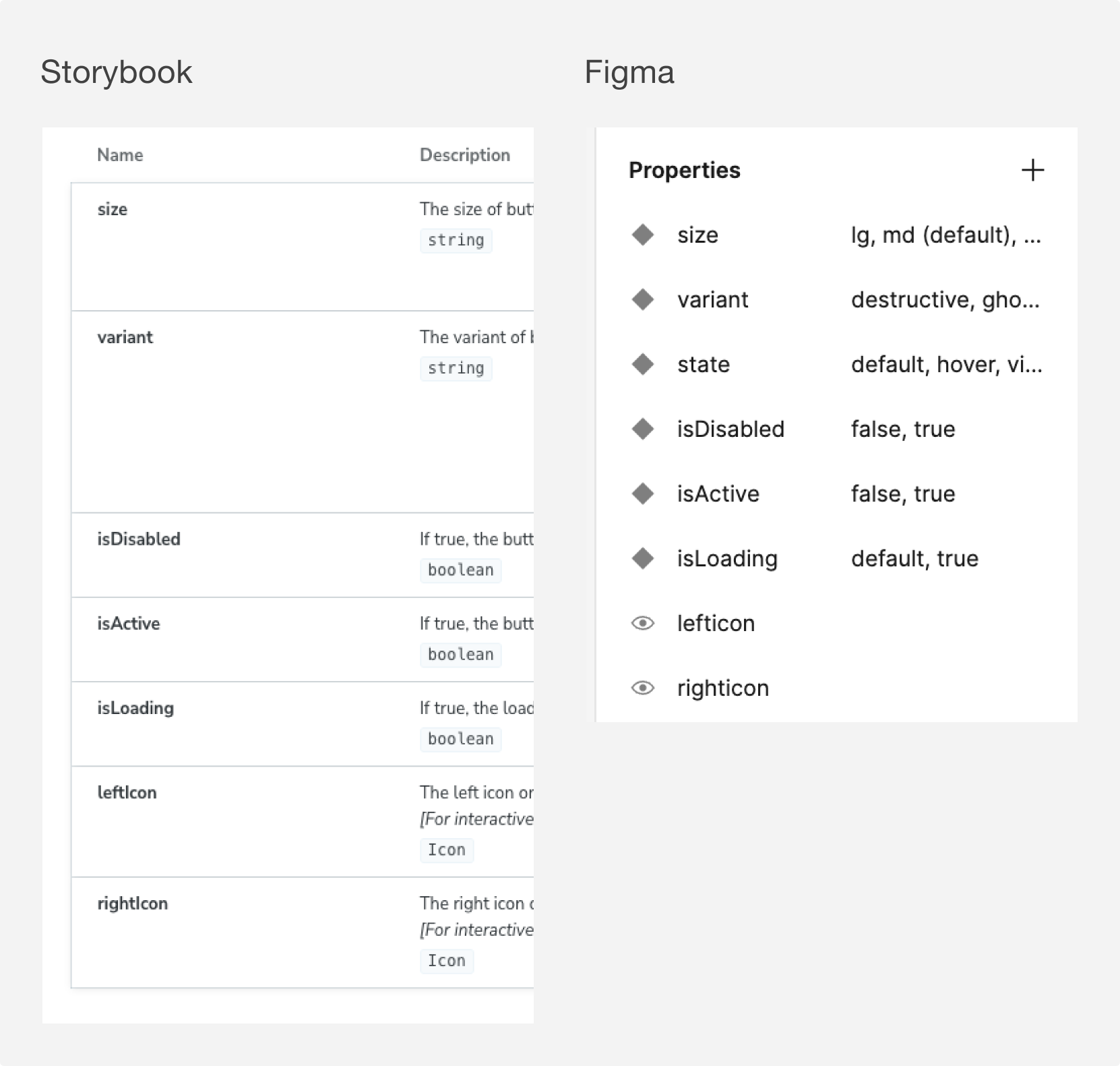
Storybook and Figma parity
During UI reviews, I discovered mismatch in both Pages and Properties between Figma and Storybook. I realized it was a mistake to overlook language and organization when reviewing components because it created opportunities for confusion between Storybook and Figma.
Mistakes– Although I had worked with engineering to document the name and definition of each state, I had not kept the exact terminology and formatting consistent in my properties panel and the engineers had applied their own verbiage inconsistently. I worked backwards to align with engineering on proper naming conventions so that we could bring Storybook and Figma into parity.
Aligning the pages in Figma and Storybook helped me better understand how components were being built and how the engineers thought about atoms and molecules.
Results
06
Despite limited resources, the design system was released within 4 months.
Increased product consistency by roughly 30-40%.
Engineers and designers reported that the new system had drastically increased their efficiency.
Updates to data tables, navigation, filters, search, pagination, and page headers were tested and updated to ensure at least 80% direct success.
User Tested Patterns
Below are a few examples of reusable patterns that I designed and tested. I wanted to ensure that the data table and it’s mechanisms were scalable, flexible, and user friendly.
Filter– I explored an option for filtering directly on columns but–after much testing–I found that my alternate designs only complicated the sort mechanism without improving the usability of the filter. After more rounds of testing and rework, users were able to achieve ~80% direct success completing various filtering tasks and expressed appreciation for the consistency. They also suggested future updates that could improve their experience, like the ability to save filters or see selected filters without having the panel open.
Search– When I tested this component, I was somewhat surprised to find that users had no difficulty locating the search button or performing a search without a visible search button inside the component. They completed search related tasks with ~90-100% success. This update did not necessarily improve usability of the search, but allowed us to consolidate the component, resulting in a cleaner design without sacrificing usability. This prototype also displays one of the many empty state variants that I designed to help users quickly process blank screens and provide them with practical next steps when needed.
Sort– Users were pleased with this simple interaction that allowed them to sort columns by clicking anywhere on the column headers. This was essentially the same pattern they were already familiar with but I made some changes to the UI by making the entire label clickable and showing the sort icon only on hover to remove visual clutter and draw attention to the sorted column.
Consistent Layouts
Consistency– The design system still has a long way to go, but its adoption drastically increased consistency (and efficiency!) across multiple pages and products.
Responsiveness
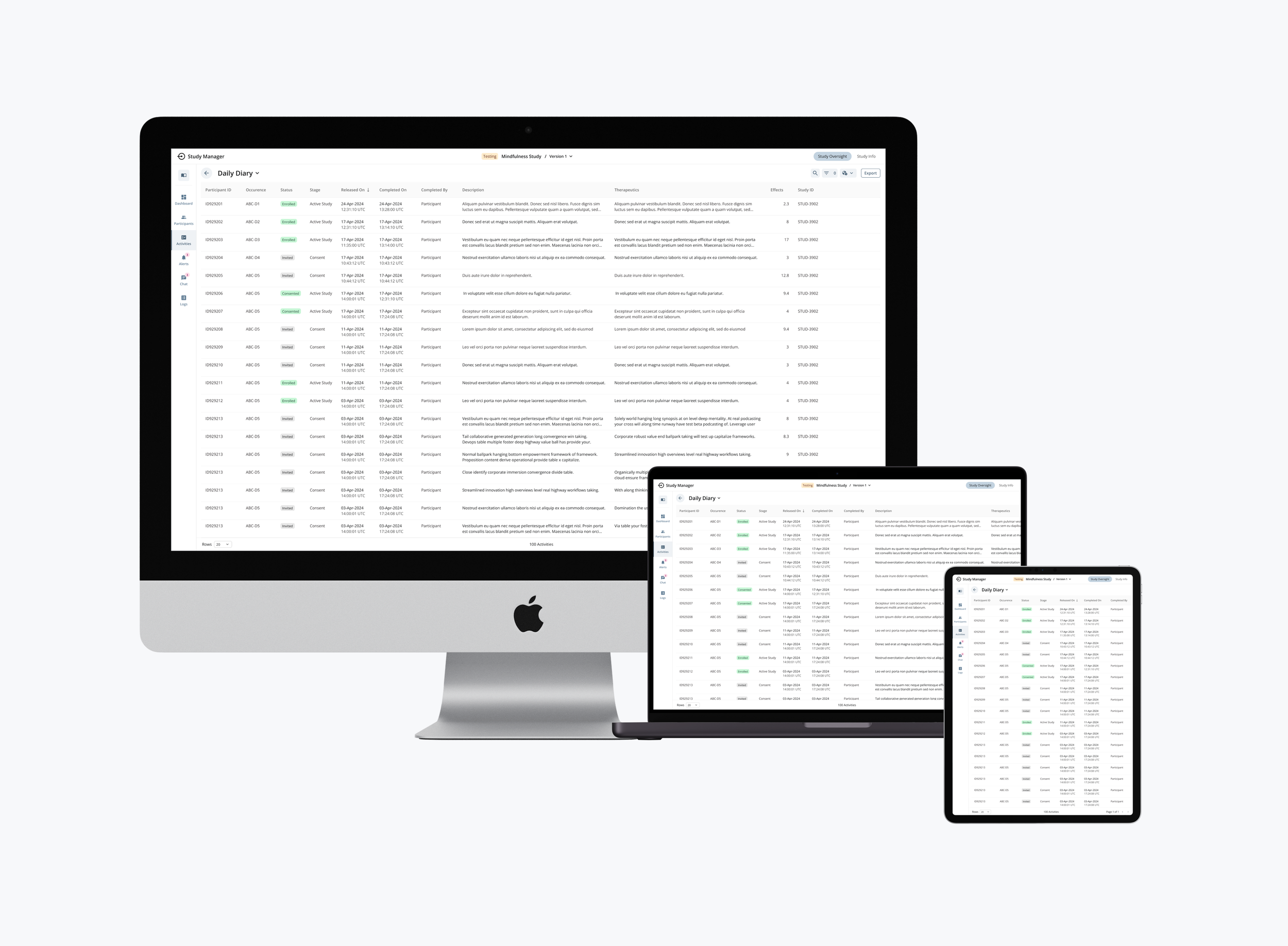
Almost all users reportedly required a secondary monitor to expand viewports and compare data. During interviews, they expressed frustration that ObvioHealth’s app were difficult to use on laptop screens because there was little space to actually view tabular data. When expanded, screen layouts were fixed and did not scale to reveal more data. I worked with engineering to define responsive behaviors for the table component that would allow users to see more tabular data by expanding the viewport. We also defined responsive patterns for smaller devices as it was becoming more common for user devices to work on tablet-laptop hybrids.
Before– Highlighted are some of the inconsistencies and painpoints identified during the initial audit and round of testing.
After– The redesign scored higher in usability tests, consolidated unused space, and increased both consistency and efficiency through the reuse of standardized patterns.
Craig Gravina
CTO at ObvioHealth
“[Eden’s] meticulous attention to detail in understanding and addressing user friction, right down to the UI component level, is truly impressive. Eden’s mastery of Atomic Design, encompassing both macro and micro perspectives of user experience, along with her ability to execute and manage a comprehensive design system, has been invaluable to our teams and the overall success of our product.”CONCLUSION
What did I Learn?
Secure Buy-In – In my role as Design Systems Lead, success was dependent on my ability to secure buy-in from leadership, other designers, engineers, and product owners. To do this, I learned how to negotiate effectively across disciplines and invite people into the design process whenever possible.
Invest in Foundations – The strength of the entire design system depends on its foundations. It’s easy to breeze through this step by reusing work from other design systems, which can be helpful, but it’s crucial to understand the needs or your own product at this stage and set up your type system, colors, grids, etc, accordingly.
Don’t Overlook Accessibility – Because the design system would be used for internal products, early iterations of the products assumed that users would not be disabled and therefore, accessibility could be deprioritized. I pushed back on this line of thinking by building accessible standards into the foundations, resulting in better readability for older users and easier keyboard navigation for power users.
Communicate Early and Often – Everyone is a stakeholder when it comes to the design system and anyone can have valuable insight. It’s important to socialize work early and often and test as much as possible.
UP NEXT


