Designing for Apple Watch
ABOUT THE PROJECT
Allergy Plus is designed to help people with seasonal allergies predict pollen levels in the air so that they can avoid or minimize allergic reactions. The phone app was built by a small team at IQVIA and is supported by Pollen.com, an allergy website powered by IQVIA.
Client
IQVIA
Role
UI Designer
Timeline
June 2023 - July 2024
Team
1 designer
3 engineers
1 product owner
01
The Challenge
Design a lightweight watch app with complications to help users quickly and easily monitor their allergy forecasts throughout the day.
Design four complication types: Users should be able to add an Allergy Plus complication to any watch face.
Design for latest updates: Consider how upcoming releases for watchOS 9 and iOS 16 might impact the designs.
Scale Down: Focus on the app’s most popular features: Allergy Forecast, Air Quality Indicator, and Today’s Weather.
Honor existing app: I had to strike a balance between referencing the phone app and using watchOS defaults and patterns.
02
Complications
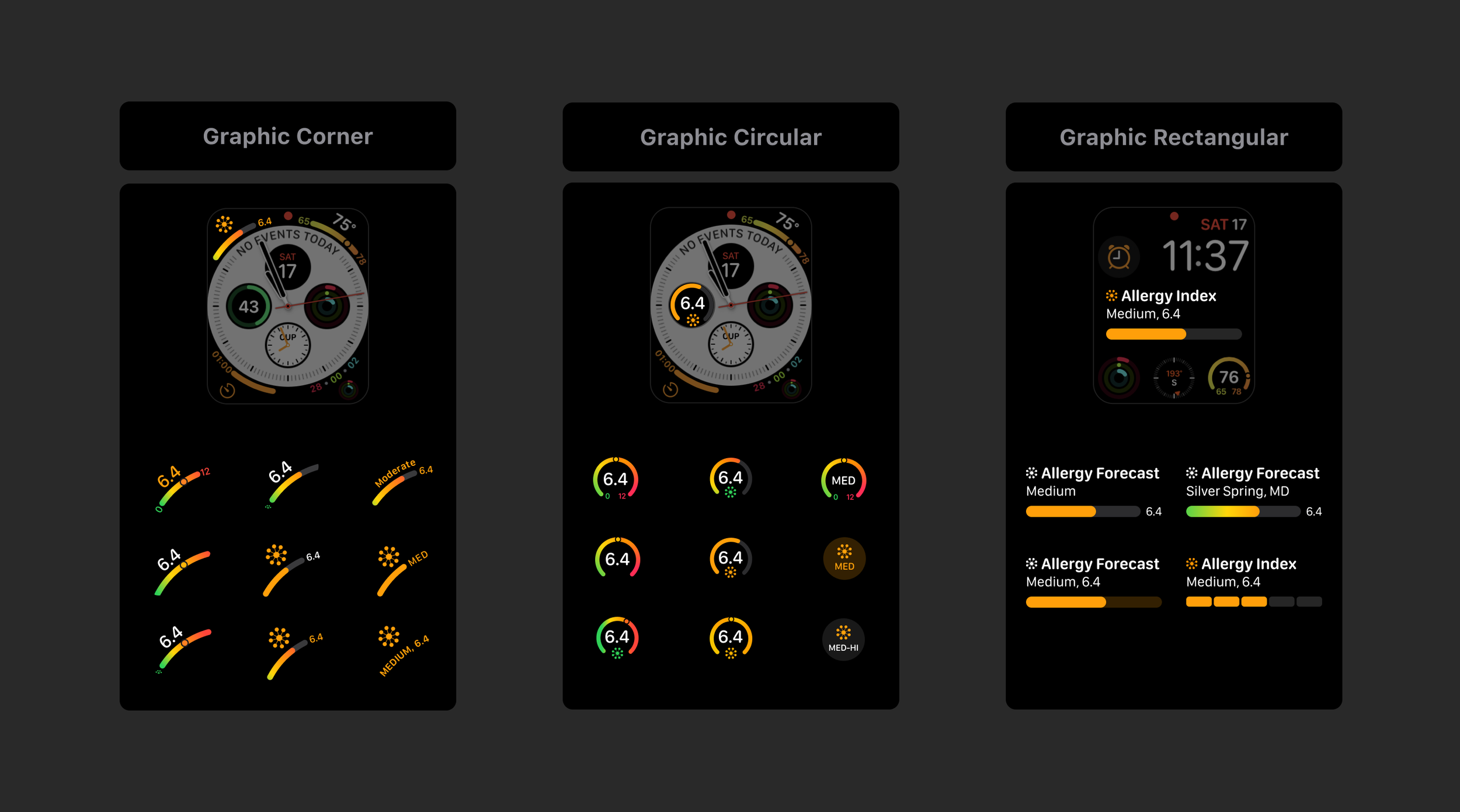
Apple Watch allows users to customize their watch face by selecting from a wide range of layouts and complications. Three of the most flexible designs that can easily be applied to popular watch faces are Graphic Circular, Graphic Corner, and Graphic Rectangular.
Iterations – I preferred designs that clearly indicate the purpose of the complication and are easy to read quickly (with or without color applied). I experimented with gradients vs solid colors, semantic vs numeric values, and range gauge vs. donut or line chart. I also kept in mind the appearance of the complications as a set.
Colors
System defaults look more visually consistent when paired with other complications and are more visible as they are designed for a dark background. I honored the app’s original design by using colors that are extremely similar and opting for a solid line rather than a gradient.
Values
I believe either could be useful depending on user preference. I decided to design with numeric values for this release and consider offering more options in the future, based on user feedback.
Symbols
Allergens icon is more familiar to iOS users and scales more effectively.
Visualizations
The donut chart is easier to read quickly, especially when only the status color is visible. The gauge design often requires users to process a wide range of colors and look for a small circle.
Final Designs
03
The App
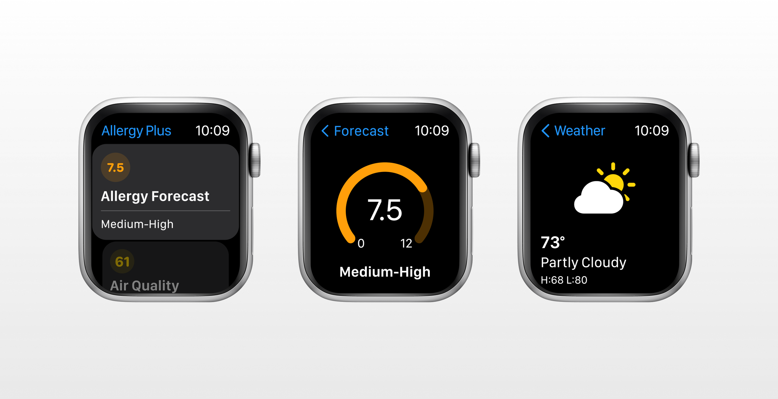
I needed to translate the three most popular Allergy Plus features into a lightweight experience for the Watch. When people are using the Apple Watch, they are often on the go and are unlikely to attempt complicated workflows. Data presentations need to be immediately clear at a glance and navigation should be simple and behave as expected.
Comparative Analysis – I looked at ways that other apps like Activity, Workout, and Lists, handle navigation. I then began sketching out possible patterns based on my findings.
Architecture – I explored different architecture options for the watch app.
Iterations – After deciding on a hierarchal navigation structure, I began iterating on the Allergy Forecast, Air Quality Index, Weather, and Home screens. To ensure a cohesive experience, I kept status colors consistent between the app and complications and used the same data visualization.
CONCLUSION
Outcomes
Users can add an Allergy Plus complication to any watch face (that displays complications).
The simple home screen design gives users an at-a-glance view of the phone app’s most relevant allergy data.
Users easily can add widgets to their iPhone lockscreen. Visualizations can be interpreted with or without color applied.
Status colors mirror the original palette as closely as possible while remaining visible and attractive. Data visualizations are consistent between the phone and watch.
UP NEXT
Enhancing travel experiences
PREVIOUS


